First world problem #1 almost done...on to finding overpriced locally grown organic food store
The bathroom is just about done. I haven't updated much about it because I've been tired from running back and forth to Home Depot and stressing about wall dimensions and paint color. This is really true. I can actually lose sleep if I can't decide between two colors of paint. I can bring myself to vomit deciding on the position of a towel bar. I will walk in and out of a room we are doing like 100 times pretending I'm going through my daily routine to figure out what layout will work the best.
I'm going to give some of my design tips because I'm really good at telling people stuff.
Tip 1
Build storage into the walls, all the time and forever. We have a small bathroom and a small house and I hate clutter. When I see clutter I feel like shaking a baby. A recessed medicine cabinet that looks like a mirror is one great option.
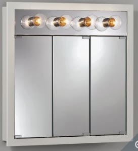
DO NOT ever buy one of these stupid medicine cabinets from the 1980's with the
light bulbs across the top. If I ever see one of this in your house you better call 911
and report some property damage
light bulbs across the top. If I ever see one of this in your house you better call 911
and report some property damage
happening because there's gonna be some property damage happening because I will be doing it.
Second point to tip #1 about storage...NO CABINETS only closets. That's a phrase I like to use even though it's not a sexual innuendo. I drove the contractor mad because I kept repeating this point as he was building the storage "closet". It is framed in with the crown molding across the top.
Right there tucked into the corner is our bathroom closet.
Also, the medicine mirror is so big and whatever...we can put lot's of stuff in it.
Also, the medicine mirror is so big and whatever...we can put lot's of stuff in it.
Tip 1a
Install an outlet inside closets and medicine cabinets. Nobody on this sick planet wants to see your tooth brush recharging. Put an outlet in the medicine cabinet, plug it in and shut the door .
Amazing....if there was a test that measured someone's
intelligent quotient I would win it.
Tip 2.001
Crown Molding. Unless this is a modern design put up crown molding that is a least 4" high (bigger than most erect penises ...hopefully). It will frame the walls like a beautiful nude picture.
Having high ceilings without crown molding says to everyone,
"I hate myself and murder puppies for fun"
We wanted a double sink but couldn't find one smaller than 40",
so we splurged on this one from pottery barn. Pottery Barn doesn't
sell anything for barns which is so stupid since it's name
says "Barn".
so we splurged on this one from pottery barn. Pottery Barn doesn't
sell anything for barns which is so stupid since it's name
says "Barn".
Tip 3 beeyotch
Don't use tile as a baseboard where the floor meets the wall. Either tile the wall or put down 4" to 5" high baseboards. First, it frames the wall nicely, but second it's tougher to match paint to tile than paint to trim.
One day I will take use our nice camera from the drawer of the desk I am
sitting at to take better pictures than my iPhone can do. .... we put in wainscoting and an
"imitation" vintage claw-foot tub. We have a shower too but the glass isn't in yet.
The wainscotings is kinda cliche but it really made the bath look good
Tip 4
There ARE rules. You hear people says, "When designing a room, there are no rules".
Um , whatever.... this is what happens when there are no rules....


Comments